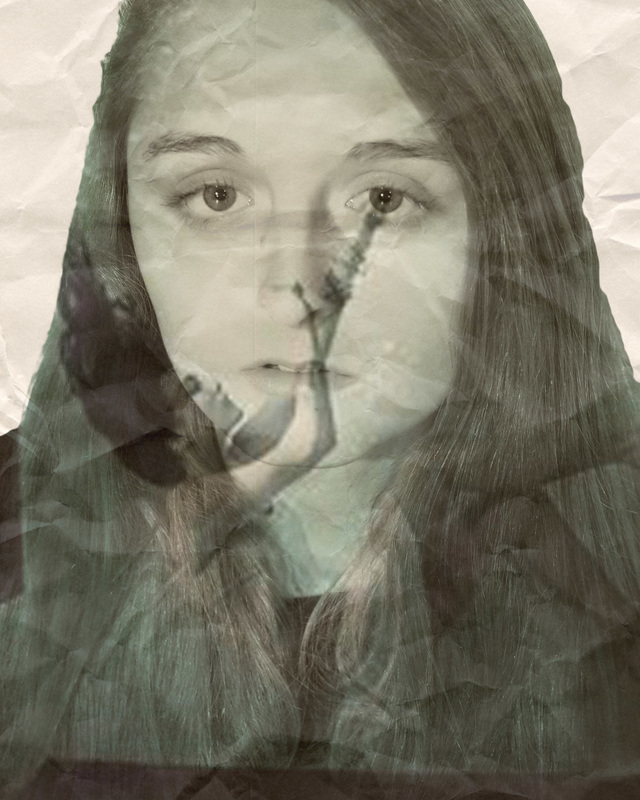
 I used Photoshop Elements 11 to create my double exposure photo. The art work is by Morgan Hale. The title of my art work is “A Time of Hurt.” It is 8x10. I created this in May 2016. This artwork was created in my Media Arts 2 class. I used the brush tool, masking, cropping, magic wand and the blend modes on Photoshop to create this image. I used the color blue in the water for sadness and water from my tears. My face and the images used were organic. I used the wrinkled paper for texture to show that once you realize your all balled up and feel like there’s no hope, all you have to do is keep trying and once you get out of that ball, everything will go back to normal but scars will remain. My image shows my depression that I went through for about 5 months. I felt that I couldn’t live any longer. I felt that I couldn’t breathe. I felt like I was drowning in my thoughts of pain and hurt. I didn’t know what to do anymore. I lost all my friends and my family didn’t even notice what was happening to me. I cried myself to sleep every night all over a boy who didn’t even care about me back. I spent a year and a half with a boy who lied about loving me. Considering the fact that he was the first boy I ever dated and the first boy for me to “love”, it hurt, a lot. And then my friends started becoming friends with him and the people who had stopped being my friends had also started to hang out with him and that’s when I reached my breaking point and thought that I didn’t belong anymore.
The arm of the girl in the photo is reaching to my eye which is tearing up. The movement of the paper in the background is making the paper look like more of a flow of water. The similarities in the art is the use of the same colors throughout the picture. Some emphasis in my art is the picture of the girl drowning because it goes well with my story and how I felt, like I was drowning in my thoughts. Also my face because it goes with sadness and depression is full of that feeling. The wrinkles in the paper make your eyes move around and also the lines of my hair makes you look up and down on the photo. My artwork makes me feel relieved to finally be able to put how I felt for so long into something that everyone can look at and relate to too see how I felt. While making the image, it made me feel like I was letting all of the past from this sad time in my life out of my memories and out of my life. It made me want to forget. The language I would use to describe the work is hurtful and the past. The work also reminds me of another time when I was involved with not being able to breather when I was at the beach and a riptide almost took me under. This artwork relates to many other stories in the world, like the way kids/adults feel when wanting to take their life or when someone is drowning. So many people in the world are dying and a lot of people who have witnessed or lost someone who has died, they feel the same way that I felt. I wouldn’t say that this is my best artwork that I have created and I wouldn’t say it is the worst. It was very hard to create because I kept getting really confused a lot and asking my peers for help. I finally had gotten the hang of it but still couldn’t figure out how to make it look like it isn’t just cut out and placed there. Saying that, I consider this more of a failure then a success. When I created the spheres and the exploding head that was when I did some of my great artwork. But the best artwork that I feel was a success that I have created was the “I Have A Dream” poster for black history month. It was so much better than the artwork that I have created recently with the double explorer. Double exposure it just very difficult for me to create. For people to judge my work they would need to make sure the picture is the right height and width, if the pictures go with the story and if I used more than one image to describe it. I feel that my work is original because it describe my story in my life and how I felt.
0 Comments
I really liked this game because it was easy to go all the way through and not struggle as much as i did with the other games. I don't usually play games on the computer so this one helped a a lot. I also liked how every time you landed on a blue square or was near it, it would pop up the definition, it made the definitions stick in my head more so that i can remember them better. I liked how i wasn't timed too because like i said before, i NEVER play computer games.
 This is an art piece by Jordan McKinney. This is my favorite student project made by him because when i personally did this project, i could not make mine look as good as his did. He made the car blend and actually look like it was where it was supposed to be. Also i like this image because this is the kind of car i really would like to get. I like how the blue really stands out in the image because everything else is brown.
He made this by finding an image of an car and putting it in Photoshop and using a texture to for the background.  My owl color wheel is my favorite artwork by far. Complementary colors are my favorite thing to work with because i like how they go together, makes the art work more interesting to follow. It was kind of difficult at first and frustration to remove the black lines where the white lines are now. Instead of painting the whole white of the owl the complementary color of the other color across from it, i left some white because it made it look cooler.
I made this image by pasting the owl image form the internet and then laid the color wheel on top if is and over laid the color wheel and used black lines to separate the different colors when i painted it so the other "triangles" wouldn't have the wrong color in it. |
AuthorI'm Morgan, and i like to talk a lot. Archives
May 2016
Categories |
 RSS Feed
